Fonts
since 5.3
Audiveris uses specific fonts for music symbols and for text symbols.
Table of contents
Music fonts
Before the 5.3 release, only one music font family was used (Musical Symbols font initially, later replaced by Bravura font for SMuFL compliance).
Since the 5.3 release, we can tell Audiveris which music font family to use by default, or for a given book or sheet.
Head symbols
This choice is key for head symbols, since the OMR engine uses a template matching technique to detect them during the HEADS step.
Here below are samples of most significant head shapes for each of the available music font families (Bravura (the default), Leland, Primus, Finale Jazz and Jazz Perc).
Pictures are magnified 4 times for a better reading:
| Head / Font-Family | Bravura | Leland | Primus | Finale Jazz | Jazz Perc |
|---|---|---|---|---|---|
| CrossHead BlackHead VoidHead WholeHead |  |  | 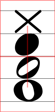 |  |  |
The head templates are built upon a specific font:
- its family is the user-selected music font family,
- its precise size is derived from the measured staff interline.
Due to the way template matching works, it is essential to carefully check the match between the input score image and the selected font family.
- The major difference is between standard fonts (
Bravura,Leland,Primus) and jazz fonts (Finale JazzandJazz Perc), especially for all the cross-like shapes. - Within the standard fonts,
Primusheads are the most narrow ones, especially for the whole-head shape. - Within the jazz fonts,
Finale JazzandJazz Percdiffer mainly by their width, and the impact on template matching is more visible on oval-like shapes.
Other symbols
For symbols other than head symbols, such as Clef, Flag, etc, recognition is not based on template matching but on a neural network.
With proper training on representative samples, the neural network is able to recognize their shape, regardless of the selected music font family.
We can observe its top 5 results in the Glyph Classifier board.
At this point, the reader may wonder why this neural network approach is not also used for head recognition… The reason is the current network needs a glyph to work upon, and there is yet no way to isolate a head glyph reliably. 1
Music fonts hierarchy
Not all symbols are available in every music font family.
To cope with this situation, Audiveris has defined a hierarchy between music font families. Hence, when a given symbol is not available in a family, the families above in hierarchy are transitively searched until the symbol is found.
The current family hierarchy is as follows:2
    Bravura
    ├── Leland
    ├── Primus
    ├── Finale Jazz
    │   └── Jazz Perc
    └── Musical Symbols
Text fonts
Texts recognition is less sensitive to font family, compared to music symbols recognition.
The main reason is that Audiveris delegates texts recognition to Tesseract OCR.3
In the 5.3 release, the user could tell Audiveris which text font family to use among the families available (Sans Serif (the default), Serif and Finale Jazz Text):
Since the 5.6 release, Audiveris uses the OCR’d word attributes to decide which font name and style best fit any given word. And the user can manually modify the result.
Please refer to the use of word attributes in the section on word editing.
Selection of music font family
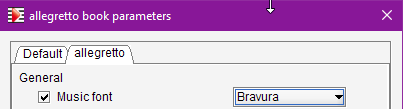
In interactive mode, we can use the Book → Set book parameters dialog in its Music font field:
In batch mode, we can make the music choice on the command line interface.
The choice is between Bravura, Leland, Primus, FinaleJazz and JazzPerc:
-constant org.audiveris.omr.ui.symbol.MusicFont.defaultMusicFamily=JazzPerc
-
There are on-going works on global recognition without prior glyph segmentation. See this Audiveris Wiki article in its “6.x prototype” section. ↩
-
The old “Musical Symbols” family has been totally replaced by “Bravura” family. It is kept only for samples generation from old
.omrprojects, something the end user can safely ignore. ↩ -
In some cases, we have observed rather poor OCR results with a Jazz-like text font, perhaps because lowercase characters are displayed as small uppercase characters. To be further investigated. ↩